MIE Forms
A flexible, embeddable form builder and renderer for creating FHIR-compatible questionnaires. Build dynamic forms with real-time preview and generate standardized QuestionnaireResponse outputs.
Key Features
Everything you need to build powerful forms
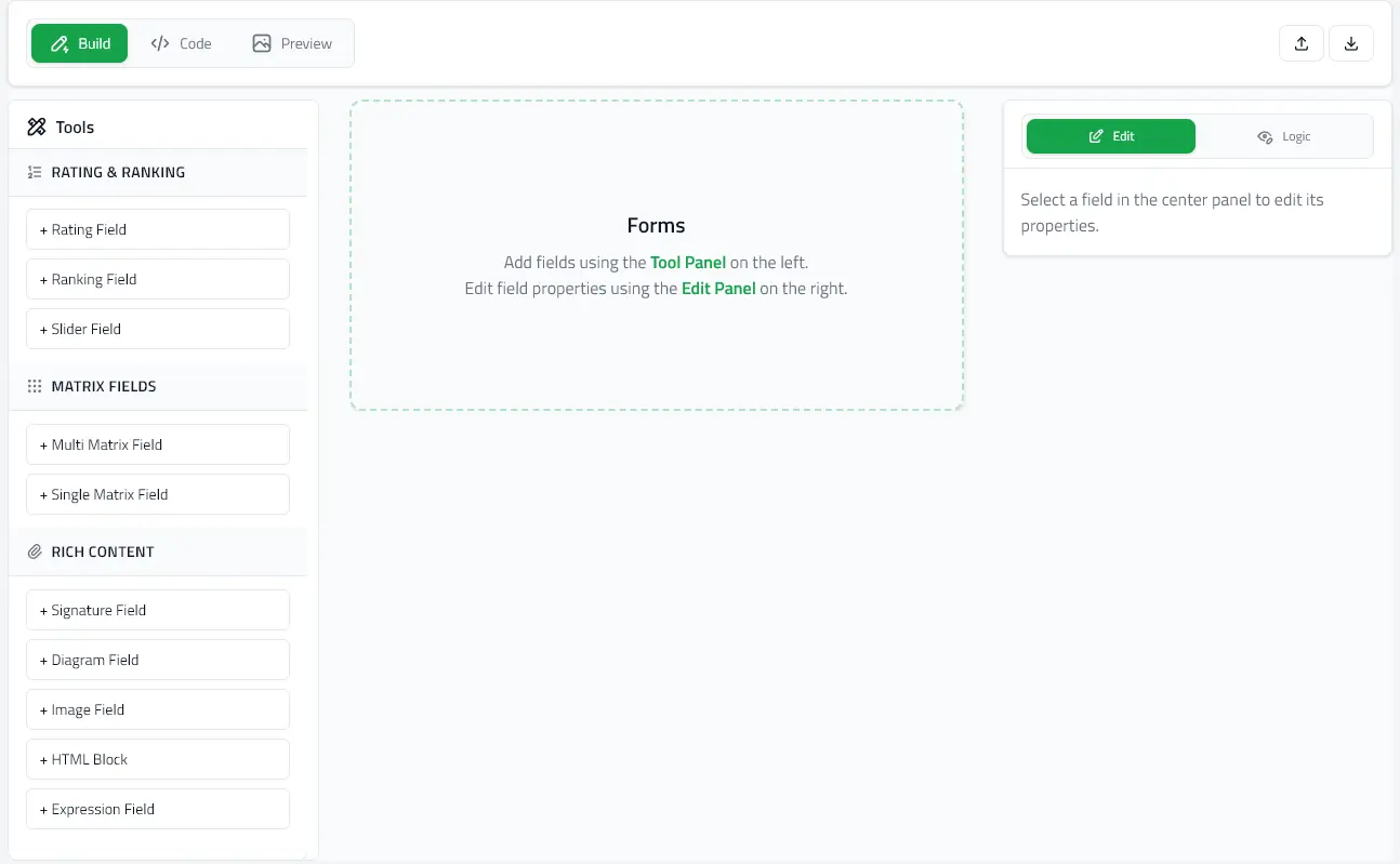
Visual Form Builder
Visual editor with code view for creating complex questionnaires with live preview
FHIR Compatible
Generate standard FHIR QuestionnaireResponse outputs for healthcare interoperability
Embeddable Components
React components ready to integrate into your existing applications
Try It Live
Experience the forms renderer in action. Edit the JSON on the left and watch the form update instantly in real-time.
Quick Start
Get up and running in minutes. Choose the package you need:
@mieweb/forms-editor
For building and editing forms
npm install @mieweb/forms-editor@mieweb/forms-renderer
For rendering forms and collecting responses
npm install @mieweb/forms-rendererNPM Packages
Install and start building in seconds
Resources
Get help and contribute