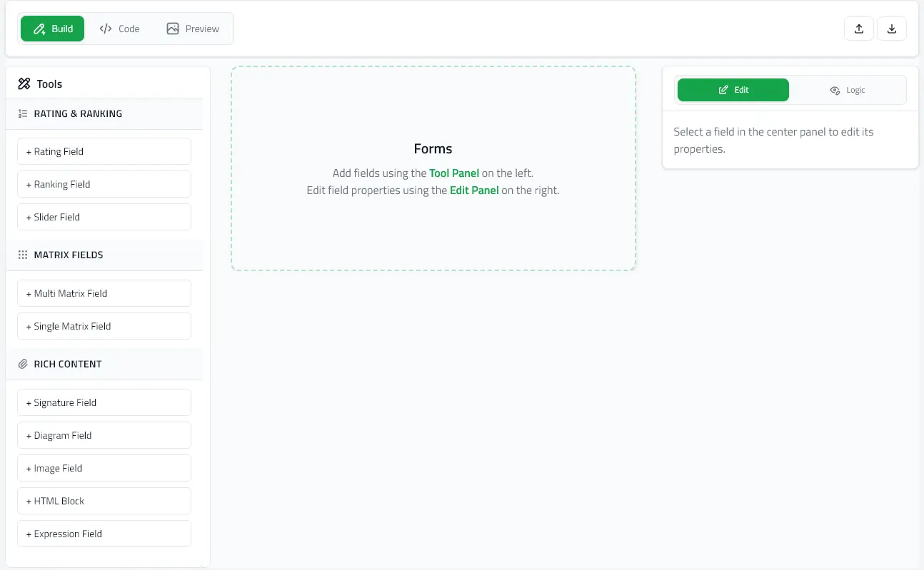
Field Editing

Detailed guide to editing field properties in Build mode.

Selecting Fields

Click any field in the canvas to open its properties panel on the right side.

Visual Indicators

  • Selected field - Highlighted with blue border
  • Properties panel - Opens on the right
  • Field actions - Duplicate and delete buttons appear

Common Properties

All fields share these core properties:

ID (Identifier)

Auto-generated unique identifier (e.g., "name-1", "email-2")
  • Purpose: Reference field in expressions and conditional logic
  • Auto-generated: Yes, based on question text
  • Editable: Yes, but keep unique across the form
  • Used in: enableWhen conditions, expression {fieldId} syntax

Question/Label

The text displayed to users
  • Most field types: Use question property
  • Expression fields: Use label property
  • Section fields: Use title property
  • Image/HTML: No question text (display-only)

Required

☐ Required field
  • Checkbox: Check to make field mandatory
  • Validation: Prevents form submission if empty
  • Visual indicator: Shows asterisk (*) next to question

Field-Specific Properties

Text & Long Text

  • Question: Field label
  • Answer: Placeholder for preview/testing
  • Required: Validation toggle

Radio, Checkbox, Dropdown, Boolean

  • Question: Field label
  • Options: List of choices
    • Each option has:
      • ID: Auto-generated or custom
      • Value: Display text shown to user
    • Add/remove options with + and × buttons
  • Selected: Current selection (for preview/testing)
  • Required: Validation toggle

Multi-Select Dropdown

Same as dropdown but allows multiple selections:

  • Selected: Array of option IDs

Rating & Slider

  • Question: Field label
  • Options: Rating levels
    • Common patterns:
      • 1-5 stars
      • 0-10 scale
      • Custom labels
  • Selected: Current rating
  • Required: Validation toggle

Ranking

  • Question: Field label
  • Options: Items to rank
  • Users drag to reorder items by preference

Matrix (Single & Multi)

  • Question: Field label
  • Rows: Questions/criteria (each with ID and value)
  • Columns: Response options (each with ID and value)
  • Single Matrix: One selection per row (radio)
  • Multi Matrix: Multiple selections per row (checkboxes)

Multi Text

Multiple labeled text inputs under one question:

  • Question: Main heading
  • Options: Sub-fields
    • Each has:
      • Value: Sub-field label
      • Answer: Input value

Expression (Calculated)

Computed field based on other field values:

  • Label: Display name
  • Expression: Calculation formula
    • Use {fieldId} to reference other fields
    • Example: {weight} / (({height} / 100) * ({height} / 100))
  • Display Format:
    • number - Plain number
    • currency - Dollar amount ($)
    • percentage - Percent (%)
    • boolean - True/false result
  • Decimal Places: Precision (default: 2)
  • Sample Data Fields: Test values for preview
    • Add field IDs and sample values to test calculations

Signature

Digital signature capture:

  • Question: Field label
  • Placeholder: Text shown in empty pad
  • Signature Data: Stroke data (JSON)
  • Signature Image: Rendered image (base64)
  • Required: Validation toggle

Diagram

Drawing canvas with optional background:

  • Question: Field label
  • Diagram Image: Background image (body chart, dental chart, etc.)
  • Placeholder: Text shown before drawing
  • Markup Data: Drawing strokes (JSON)
  • Markup Image: Rendered drawing (base64)
  • Required: Validation toggle

Image

Display-only image block:

  • Label: Optional image title
  • Image URI: URL or base64 data URI
  • Alt Text: Accessibility description
  • Caption: Text below image
  • Size: Display size
  • Alignment: Left/center/right
  • Padding: Spacing around image

HTML

Rich HTML content display:

  • HTML Content: HTML markup
  • Iframe Height: Container height (pixels)

Rendered in sandboxed iframe for security.

Section

Organizational container:

  • Title: Section heading
  • Fields: Nested child fields

Sections can contain any field types including other sections.


Conditional Logic (enableWhen)

Show/hide fields based on other answers:

Adding Conditions

  1. Select a field
  2. Scroll to Conditional Logic section
  3. Click Add Condition
  4. Configure:
    • Logic Type: AND (all true) or OR (any true)
    • Target Field: The field to watch
    • Operator: equals, contains, includes, greaterThan, etc.
    • Value: Comparison value

Condition Operators

  • equals: Exact match (works with text and option IDs)
  • contains: Substring match (text fields)
  • includes: Array contains value (multi-select fields)
  • greaterThan / lessThan: Numeric comparison (expression fields)
  • greaterThanOrEqual / lessThanOrEqual: Numeric comparison with equals

Example

Show "Allergy Details" only when "Has Allergies" = "Yes":

Field: allergy_details
Conditional Logic:
Logic: AND
Conditions:
- Target: has_allergies
- Operator: equals
- Value: yes (option ID)

See Conditional Logic Guide for detailed examples.


Field Actions

Duplicate

Creates a copy of the selected field with:

  • Same properties
  • New unique ID
  • Inserted below original

Delete

Removes field from the form permanently.

Warning: Deleting a field referenced in expressions or conditions will break those references.


Tips & Best Practices

Field IDs

  • Keep IDs short and descriptive: name, email, dob
  • Use consistent naming: section_demographics, section_medical
  • Avoid spaces and special characters
  • Don't change IDs if field is used in expressions/conditions

Questions

  • Be clear and specific
  • Use plain language
  • Avoid ambiguity
  • Include units where needed ("Age in years", "Height in cm")

Options

  • Keep values concise
  • Use consistent capitalization
  • Provide "Other" or "Prefer not to say" when appropriate
  • Order logically (alphabetical, numerical, most-to-least common)

Required Fields

  • Only mark essential fields as required
  • Provide clear error messages
  • Test form completion flow in Preview mode

Next Steps